A few months ago BenQ contacted me to see if I was interested in reviewing one of their new monitors, the SW2700 PT. Although very happy with the NEC PA241W I’ve used for about 6 years, I had been looking around for a second, larger monitor with higher resolution to accompany it. So I pretty much bit their hand off to take a look at the monitor.
Before going through my set-up and thoughts on the SW2700PT, let’s cover the basics. BenQ is targeting photographers and graphics artists with this offering. I remember BenQ popping up on my radar as a gamer years ago, they seemed to be offering good quality, good value monitors for that niche. The demands of gamers and general computer users are quite different to those of a photographer so it’s interesting to see them stepping in this direction.
It’s a 27” monitor with a resolution of 2560x1440 (16:9 aspect ratio). It uses an IPS panel, which is pretty much standard for monitors dedicated to photographers as they provide greater colour accuracy, consistency and viewing angles to other types. BenQ claims it covers 99% of the AdobeRGB which my later testing showed to be accurate. In terms of connectivity it offers a DVI port, an HDMI port and a DisplayPort (DP) port. Other things that might be of interest is that it includes a 2 port USB 3.0 hub and an SD card reader which is handy for photographers. It also includes a shading hood which is a nice touch to help reduce glare and reflections on the screen.
But really, you can get that information elsewhere (e.g. BenQ’s website!) and if you’re like me you probably don’t find the technical specs of a monitor particularly interesting, so let’s move on to talk about using the monitor and how it works in practice.
Disclaimer: if not already obvious BenQ gave me this monitor to review. I told them that I would do so honestly and objectively to maintain my integrity, which they were 100% happy with. The below thoughts are my honest opinion. Ulimately if it was a bad monitor - which it isn't! - there would be no point me saying nice things about it anyway just so I could keep a bad monitor!
My previous set-up was a 24” NEC plugged into my 15” MacBook Pro via DisplayPort. I’d pop open the MBP to give me a second screen, but really, it’s too small for normal desktop use, especially being a Retina display. So I was mostly using a single screen.
So when I made some room on my desk for this new 27” BenQ I was kind of blown away by the sense of virtual space in front of me! Both monitors side-by-side take up my whole desk, and the extra screen real estate is vast. The experience is like going from watching a film on your home TV and then going to an iMax cinema – a much more immersive and enjoyable experience.
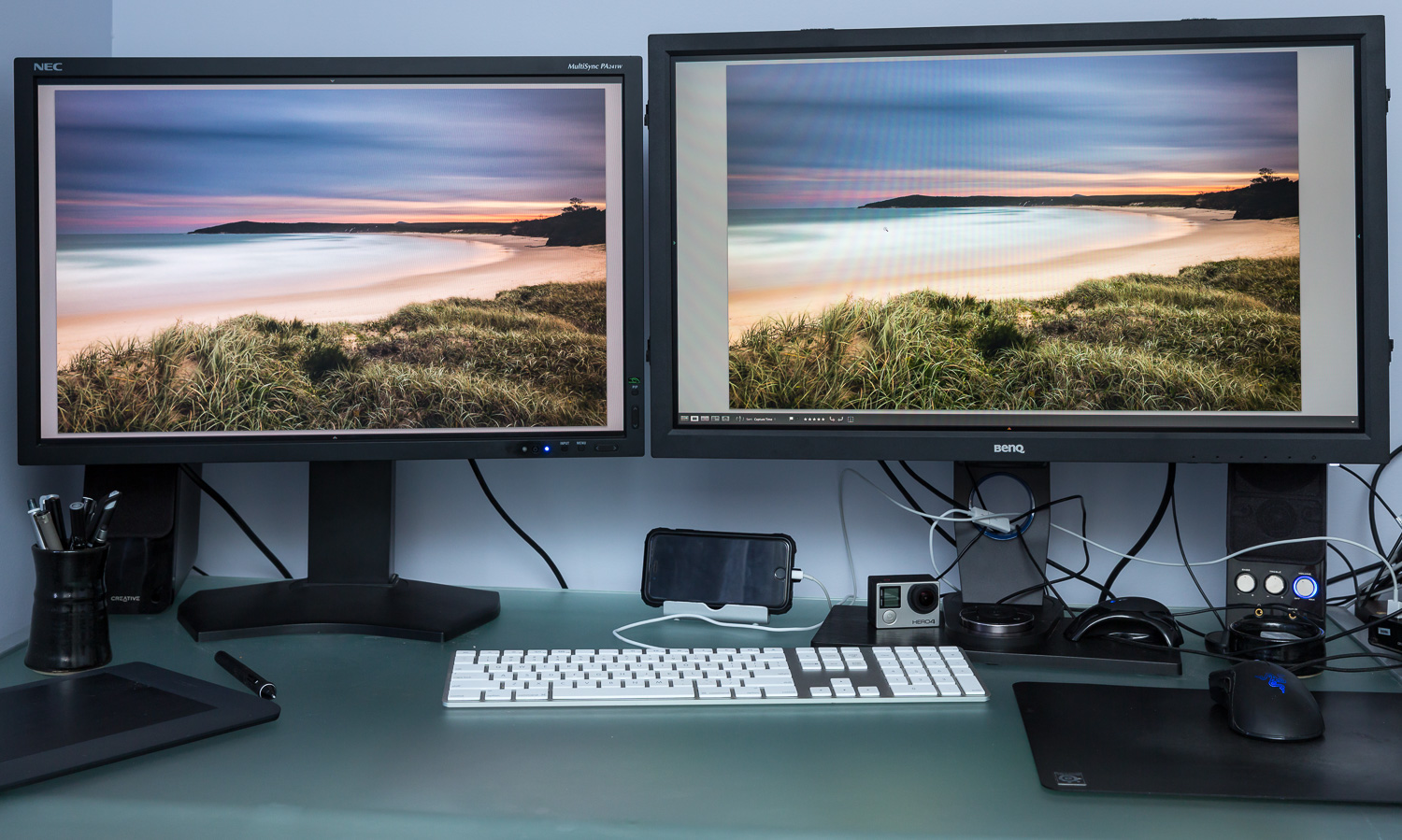
Figure 1: NEC on the left, BenQ on the right. Try to ignore the colour differences, a photo of a photo on a screen rarely looks as it should in real life!
Even using it in a single monitor configuration it makes my NEC seem tiny. Whilst I may have been pondering a larger monitor, I didn’t really think I needed anything more than 24”. Well, I was wrong. Those extra 3 inches make the world of difference. Similarly, I never thought a few extra pixels going from a resolution of 1920x1200 to 2560x1440 would mean much in real life, but again it does! There’s just so much more room to do everything, such that my NEC feels palpably claustrophobic if I use it alone. It might sound strange to think of a screen being either claustrophobic or freeing, but that’s the closest sensation to convey the feeling of limited screen space.
So my first conclusion is that I now need a 27” monitor in my life, ideally as part of a dual screen set-up. If you find yourself butting up against the edges of your small monitor, I cannot impress upon you enough how much more enjoyable a large monitor is to use for editing photographs, as well as everyday computing tasks. It’s not inconceivable for me to have multiple applications side-by-side on the BenQ, which I would never do on my 24” which I’d always use with a single full-screen app.
Ok, so I’m totally sold on a 27” monitor. The question that remains is “does the BenQ SW2700PT fulfill my needs as a photographer?’.

Figure 2: screenshot of Lightroom CC on the NEC PA241W. I've been used to this view for years. I'd always hide the panels to give me a bit more room.
Figure 3: by comparison the BenQ, helped by it's 16:9 aspect ratio, feels very expansive. Rather than Lightroom's panels and UI taking up large parts of the screen, the images take centre stage.
As I suggested at the start of this review, the needs of a photographer are quite different to most other computer users. Most users may want a punchy cinematic experience and fast response times. As a photographer, what I’m looking for is a more natural looking display, with good colour accuracy and consistency. I’m less interested in my photographs looking totally awesome on my screen when they might look like crap elsewhere. I want a monitor that gives me confidence in my adjustments and final result, so that I can trust what I see on the screen is what others will see and, more importantly, when I print. So let’s talk about some of those factors.
Firstly, colour gamut. The BenQ offers 99% of the AdobeRGB standard. This is important because I want to know that the colours that the monitor is showing me are what are actually in the photograph I’m editing. With a small colour space, such as sRGB, I may be making modifications outside of the colour space that are clipped and so not shown accurately by the screen. Having a ‘what you see is what you get’ (WYSIWYG) experience is important. Whilst most often I’ll export from Lightroom into the smaller sRGB colour space – primarily for web usage – it’s a better workflow to work in the larger colour space, and then reduce to the smaller colour space than vice-versa.
Like most monitors, I found the SW2700PT too bold and bright out of the box for my usage. This doesn’t really matter as calibration is a necessary step with any monitor, but just be aware that you can’t just unbox a monitor and expect it to give you a 100% accurate result without calibration.
Once calibrated the screen looks really good, and a pretty good match to the NEC sitting next to it. I’ll be honest, I had to do a bit of work to get to that point. Now I’m not a colour scientist or a guru when it comes to calibrating displays, but I’m fairly technical and think I have a good handle on what I need to do to get things working.
I initially used the Pallette Master Element software included with the monitor (note that software is included, but the required hardware calibration device is not). The result of this, particularly next to my calibrated NEC, had a distinct warm magenta cast to it which was pretty distracting. I then used BasICColor Display 4 which is what I have always used quite happily with my NEC monitor. The result was better, but still the screen seemed a bit pink.
Finally I used the Sypder4Elite software bundled with my Spyder4 calibrator and the result seemed much better, with a slight post-calibration tweak using SpyderTune to remove the last hint of pink getting the two monitors looking visually very close side-by-side. As I caveated, I’m no colour management expert beyond a practical level of knowledge (it’s the kind of thing I just want to work, rather than want to know all of the science behind it!) and there’s a possibility that there was some configuration difference between the 3 software packages I used. I did read other reviews that mentioned better calibration results with 3rd party packages rather than the included PaletteMaster Element which confirms my own findings. Given that you have to buy a hardware calibrator anyway, you might as well try to calibrate with its included software too.
But as I say, once calibrated I’m very happy with how the display looks. My NEC remains my reference as that has allowed me to print very accurately for some years, but after this calibration exercise I have confidence in the results from my BenQ. I guess I’d just make a note to keep an extra eye out for a possible magenta (or green, it’s compliment) tint in the final print.
One potentially noteworthy thing is that having received and calibrated the unit in October it successfully validated the calibration at the end of December, meaning that the calibration or rather the screen didn’t ‘drift’ and so could be trusted. My NEC has validated calibrations for as long as I can remember, but past screens – indeed even my MBP’s screen – seem to need recalibration every time. So it’s reassuring that so far the calibration is consistent. If there’s one thing we photographers lack enthusiasm more than backing up it is probably calibrating our displays!
My biggest at least potential issue with the display is regarding uniformity. Uniformity is important because I want the whole screen to display accurate colours and brightness, not just the centre. If the display is not uniform then dark areas or colour shifts can be seen in portions of the screen. This then requires some second guessing to know to what extent any shift is due to the display rather than something in the file being edited.
You can see from the charts below that the BenQ had some issues with colour uniformity, particularly in the top right corner which had a deltaE of 5.2 (when calibrating, the software typically targets a deltaE under 2 to be considered within tolerance). Similarly, the luminance uniformity test showed a discrepancy of 6% left of centre, and 9% right of centre – essentially the left and right sides of the screen are darker than the centre.

Figure 3: BenQ SW2700PT Colour Uniformity test result

Figure 4: BenQ SW2700PT Luminance Uniformity test result
Comparing the uniformity test results with the NEC and you will see that the NEC exhibits almost remarkable uniformity and consistency in both tests. In short, you are better able to trust that what you see on the NEC than the BenQ. In reality, I’m not sure how much of a problem this actually is. Certainly when editing images side-by-side on both monitors I haven’t noticed anything too strange. It’s more noticeable when viewing a white page full screen. As I write this the bottom left corner looks warmer (more yellow) than the rest of the screen. But if I pop-up Lightroom and have the same image on both screens you’d have a hard time picking the difference. My conclusion is that it’s not a huge problem.

Figure 5: NEC PA241W Color Uniformity test result

Figure 6: NEC PA241W Luminance Uniformity test result
It’s worth mentioning the cool little USB puck that comes with the monitor. It’s a little round thing that sits in a recess in the monitor’s base with buttons that can be used to control the monitor’s onscreen display (OSD) aka menu to make adjustments. This is a much better solution than having to fiddle with small buttons along the bottom edge of the monitor’s bevel, nice. Better yet, the puck can be used to change the calibration profile on the fly. Out of the box this comes configured to allow you to switch between AdobeRGB, sRGB and Black and White. You can reconfigure the buttons to swap between your own calibration profiles so, for example you could have a "Calibration 1" profile as your normal working profile, a "Calibration 2" profile for print proofing, and an sRGB profile to give you an idea what the rest of the world will see when you publish your photo on the internet. The downside is that these on-the-fly calibration profile changes require the profiles to be created by PaletteMaster Element which sadly didn’t give me the best result.
I’m not too fussed about how a monitor looks as long as it’s not quite obviously ugly, but the BenQ is actually a sleek, elegant looking unit that looks good on the desk. It has a hole in the base which helps to tame the unruly mess of cables I find myself beset with. As mentioned it also has 2 USB ports and an SD card reader. These are on the left of the unit which at the moment means they are impeded by my NEC monitor next to it. I should really try swapping the displays over to make use of them, although I generally dislike cables dangling out the side of my monitors (see “unruly mess of cables above”!).
Overall, I’m very impressed with the SW2700PT. Indeed I’m impressed with it to the point that it has become my primary working display. Considering the unit it replaced comes from one of the most respected manufacturers in the game, that’s quite an achievement. With its extra screen real estate, good colour accuracy, and an overall pleasing viewing experience it’s quite a pleasure to use.
My NEC won’t be going anywhere and I will continue to use it for its higher accuracy and uniformity for print matching. But if you were in the market for a do-it-all monitor it’s pretty hard to look past the BenQ, especially considering the price point and extra accessories (e.g. screen hood, calibration software). It’s not quite up there with the NECs and Eizos of the world, but it’s also about half the price for a comparable screen size and would certainly meet the needs of most photographers. It’s certainly interesting to see BenQ head in this direction, and perhaps they will carve out a niche as the affordable alternative to NEC and Eizo.
If you have any questions about the BenQ SW2700PT just leave a comment below and I'll do my best to help.


![View From the Pyramid, Girraween NP [GIR01]](https://images.squarespace-cdn.com/content/v1/57cfb4c5ff7c5074fe8f3a0c/1482396321529-D4R7OVI1O3B29WNMVRH1/View-From-the-Pyramid-Girraween-NP-%5BGIR01%5D-DAF-20161021-1950.jpg)
![Balancing Rock, Girraween NP [GIR03]](https://images.squarespace-cdn.com/content/v1/57cfb4c5ff7c5074fe8f3a0c/1482396200919-ORHO9IXP8T9G7F6WV4HY/Balancing+Rock%2C+Girraween+NP+%5BGIR03%5D-DAF-20161021-1989.jpg)
![Balancing Rock and Second Pyramid, Girraween NP [GIR05]](https://images.squarespace-cdn.com/content/v1/57cfb4c5ff7c5074fe8f3a0c/1482396192652-6CM5ANP26SPQHOJDNDXP/Balancing+Rock+and+Second+Pyramid%2C+Girraween+NP+%5BGIR05%5D-DAF-20161021-2044.jpg)
![Balancing Rock and Second Pyramid, Girraween NP [GIR09]](https://images.squarespace-cdn.com/content/v1/57cfb4c5ff7c5074fe8f3a0c/1482396193393-0S1G6DHRC3KCEMXZRYH5/Balancing+Rock+and+Second+Pyramid%2C+Girraween+NP+%5BGIR09%5D-DAF-20161021-3683.jpg)
![Underground Creek, Girraween NP [GIR11]](https://images.squarespace-cdn.com/content/v1/57cfb4c5ff7c5074fe8f3a0c/1482396304207-RX37UE4FWFB6AU8BCAS8/Underground+Creek%2C+Girraween+NP+%5BGIR11%5D-DAF-20161022-3730-Edit.jpg)

![Bald Rock Creek, Girraween NP [GIR13]](https://images.squarespace-cdn.com/content/v1/57cfb4c5ff7c5074fe8f3a0c/1482396203969-B2RJMGFYTPVQNVQ6166U/Bald+Rock+Creek%2C+Girraween+NP+%5BGIR13%5D-DAF-20161022-2122.jpg)
![Bald Rock Creek, Girraween NP [GIR16]](https://images.squarespace-cdn.com/content/v1/57cfb4c5ff7c5074fe8f3a0c/1482396211641-CO54R31PC1W4PBYAKTIT/Bald+Rock+Creek%2C+Girraween+NP+%5BGIR16%5D-DAF-20161022-3931.jpg)
![Lone Tree, Girraween NP [GIR17]](https://images.squarespace-cdn.com/content/v1/57cfb4c5ff7c5074fe8f3a0c/1482396240173-RY58QLUAM6LV16ZRLARU/Lone+Tree%2C+Girraween+NP+%5BGIR17%5D-DAF-20161022-2258.jpg)
![Bushland, Girraween NP [GIR12]](https://images.squarespace-cdn.com/content/v1/57cfb4c5ff7c5074fe8f3a0c/1482396224402-QLUGAV9ROMCIPR7H32RD/Bushland%2C+Girraween+NP+%5BGIR12%5D-DAF-20161022-2120.jpg)
![Fallen Tree, Girraween NP [GIR15]](https://images.squarespace-cdn.com/content/v1/57cfb4c5ff7c5074fe8f3a0c/1482396228217-GREF137S1TZYULXHJJUJ/Fallen+Tree%2C+Girraween+NP+%5BGIR15%5D-DAF-20161022-2194.jpg)
![Green and Black, Girraween NP [GIR23]](https://images.squarespace-cdn.com/content/v1/57cfb4c5ff7c5074fe8f3a0c/1482396236337-XUU9HVBTRXRGDP9ER39M/Green+and+Black%2C+Girraween+NP+%5BGIR23%5D-DAF-20161023-2462.jpg)
![Mount Norman, Girraween NP [GIR21]](https://images.squarespace-cdn.com/content/v1/57cfb4c5ff7c5074fe8f3a0c/1482396248467-C53C4388KJMEV2064MDY/Mount+Norman%2C+Girraween+NP+%5BGIR21%5D-DAF-20161023-4060.jpg)
![Near The Junction, Bald Rock Creek, Girraween NP [GIR18]](https://images.squarespace-cdn.com/content/v1/57cfb4c5ff7c5074fe8f3a0c/1482396251346-GORT9LZB30560PWUCM85/Near+The+Junction%2C+Bald+Rock+Creek%2C+Girraween+NP+%5BGIR18%5D-DAF-20161022-3948.jpg)
![Pyramid Two from Pyramid One, Girraween NP [GIR07]](https://images.squarespace-cdn.com/content/v1/57cfb4c5ff7c5074fe8f3a0c/1482396259736-XBC3MTBI62JWP0E0Z322/Pyramid+Two+from+Pyramid+One%2C+Girraween+NP+%5BGIR07%5D-DAF-20161021-3662.jpg)
![Pyramid Two from Pyramid One, Girraween NP [GIR10]](https://images.squarespace-cdn.com/content/v1/57cfb4c5ff7c5074fe8f3a0c/1482396263764-53ZTWVQHO5BGWOZO56QZ/Pyramid+Two+from+Pyramid+One%2C+Girraween+NP+%5BGIR10%5D-DAF-20161021-3694.jpg)
![Second Pyramid, Girraween NP [GIR06]](https://images.squarespace-cdn.com/content/v1/57cfb4c5ff7c5074fe8f3a0c/1482396273088-CIJB50OSGDCQY2M9HBEY/Second+Pyramid%2C+Girraween+NP+%5BGIR06%5D-DAF-20161021-2053.jpg)
![Second Pyramid from Pyramid One, Girraween NP [GIR02]](https://images.squarespace-cdn.com/content/v1/57cfb4c5ff7c5074fe8f3a0c/1482396274117-A2NSB28F5VV3VYLPS6DZ/Second-Pyramid--from-Pyramid-One-Girraween-NP-%5BGIR02%5D-DAF-20161021-1962.jpg)
![The Junction, Girraween NP [GIR25]](https://images.squarespace-cdn.com/content/v1/57cfb4c5ff7c5074fe8f3a0c/1482396284185-ALCI0SLVHKOIVGUY6ZRU/The+Junction%2C+Girraween+NP+%5BGIR25%5D-DAF-20161023-4188.jpg)
![The Pyramids, Girraween NP [GIR19]](https://images.squarespace-cdn.com/content/v1/57cfb4c5ff7c5074fe8f3a0c/1482396283767-XU86EK6ZAMENAMXIP4K5/The+Pyramids%2C+Girraween+NP+%5BGIR19%5D-DAF-20161022-3972.jpg)
![Tree bark scar, Girraween NP [GIR22]](https://images.squarespace-cdn.com/content/v1/57cfb4c5ff7c5074fe8f3a0c/1482396293269-CZ4OBEO7U4SRYDPDKBKG/Tree+bark+scar%2C+Girraween+NP+%5BGIR22%5D-DAF-20161023-2449.jpg)
![Twisted Tree, Girraween NP [GIR08]](https://images.squarespace-cdn.com/content/v1/57cfb4c5ff7c5074fe8f3a0c/1482396294302-3GQR664MKK6SDTUAKZ4S/Twisted+Tree%2C+Girraween+NP+%5BGIR08%5D-DAF-20161021-3675.jpg)
![View from Mount Norman, Girraween NP [GIR20]](https://images.squarespace-cdn.com/content/v1/57cfb4c5ff7c5074fe8f3a0c/1482396315455-7G59CZZBFEQWK3XDSDUO/View+from+Mount+Norman%2C+Girraween+NP+%5BGIR20%5D-DAF-20161023-3974.jpg)
![Bald Rock Creek, Girraween NP [GIR24]](https://images.squarespace-cdn.com/content/v1/57cfb4c5ff7c5074fe8f3a0c/1482396214729-SASE82HHP7MAGS7CUD3C/Bald+Rock+Creek%2C+Girraween+NP+%5BGIR24%5D-DAF-20161023-4170.jpg)
![View From the Pyramid, Girraween NP [GIR04]](https://images.squarespace-cdn.com/content/v1/57cfb4c5ff7c5074fe8f3a0c/1482396315229-U2K8UWSLN5OQ7SE2VCIO/View+From+the+Pyramid%2C+Girraween+NP+%5BGIR04%5D-DAF-20161021-2024.jpg)